

Simply Bliss Cleaning Logo
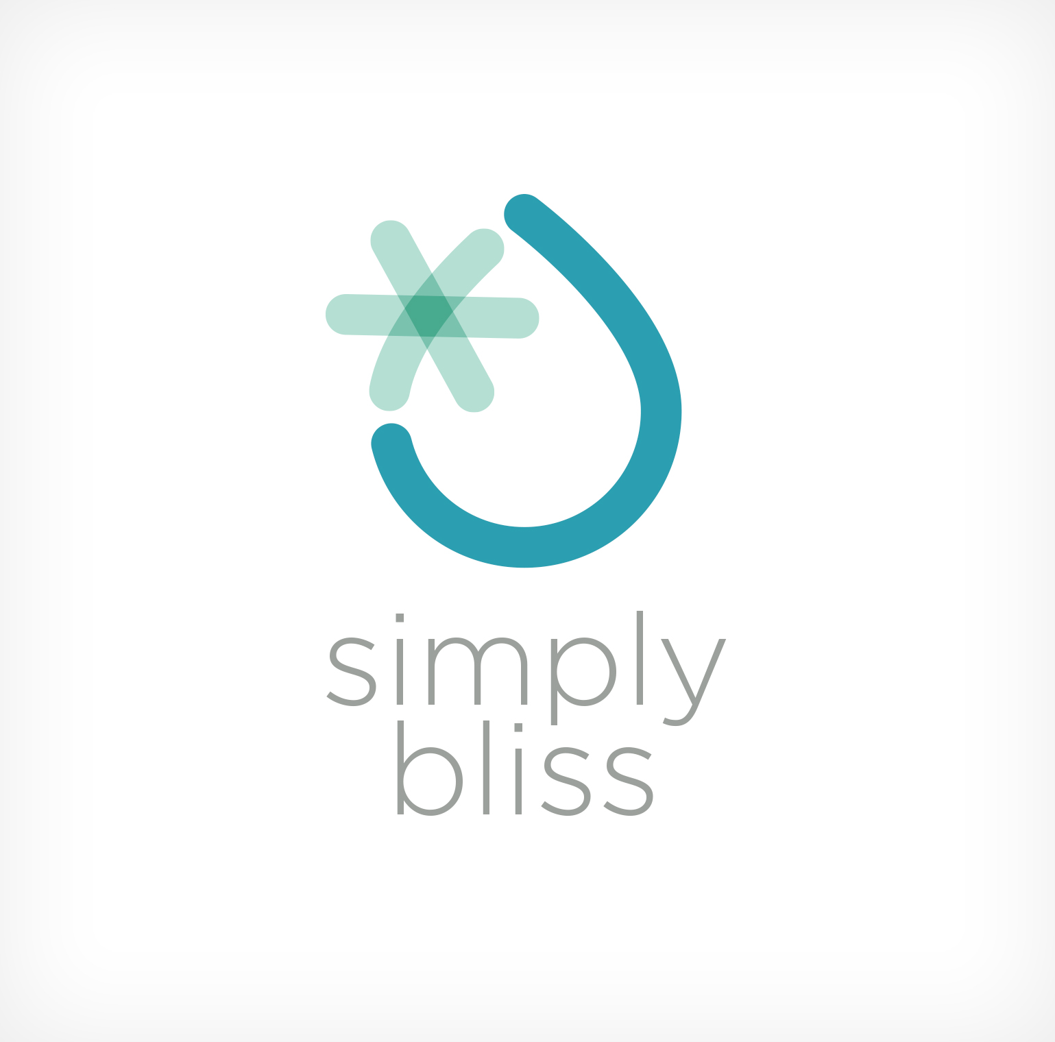
Simply Bliss Cleaning requested a logo that was clean without being sterile. They wanted something that seemed friendly.
The water drop represents the cleaning part of their company. The shine adds a touch of whimsy and serves as an asterisk to denote the other services the company offers. This shine symbol is used in branding where a full logo would seem heavy.

